Read your dashboard
Publishing volume, platform metrics, link clicks, and account health at a glance.
The Dashboard is your daily pulse: what published, what's scheduled, what failed, and how it performed. Pick a range — 7D, 30D, 90D, or Custom — and hit Refresh for the latest numbers.
The headline numbers
Six cards across the top summarize the selected window:
| Card | What it tells you |
|---|---|
| Published | Posts that went out successfully. |
| Scheduled | Posts queued to publish. |
| Failed | Posts that hit an error — review these. |
| Success rate | Published vs failed. |
| Link clicks | Clicks on your short links. |
| Engagement | Total engagement reported by the platforms. |
Below them, the Reporting window panel adds root posts, active accounts, media attach rate, and your best hour to publish. The Failed posts panel lists anything that needs review, with the platform's error message.
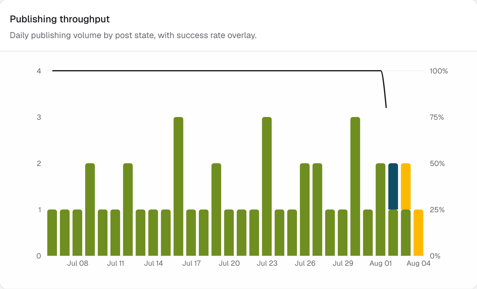
Publishing throughput
Daily publishing volume by post state, with a success-rate overlay — gaps and failure spikes stand out immediately.
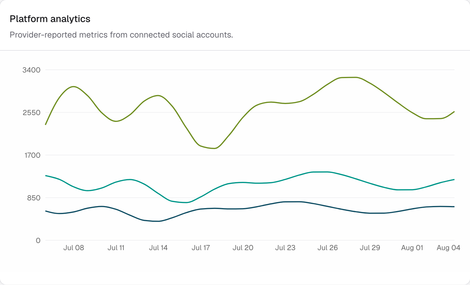
Platform analytics
Provider-reported metrics — impressions, engagements, likes — from your connected accounts, as one timeline.
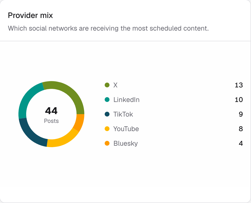
Provider mix
Which networks receive most of your content.
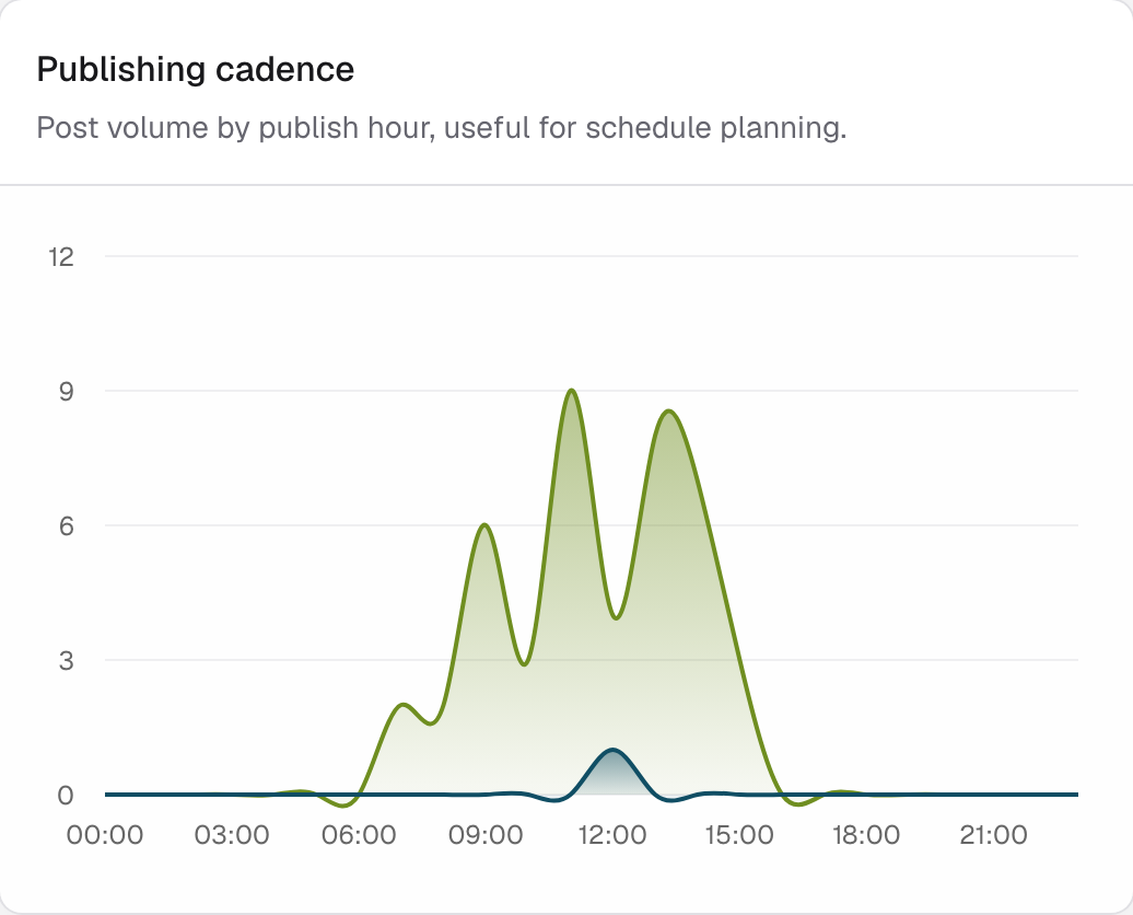
Publishing cadence
Post volume by hour of day — useful when planning weekly posting schedules.
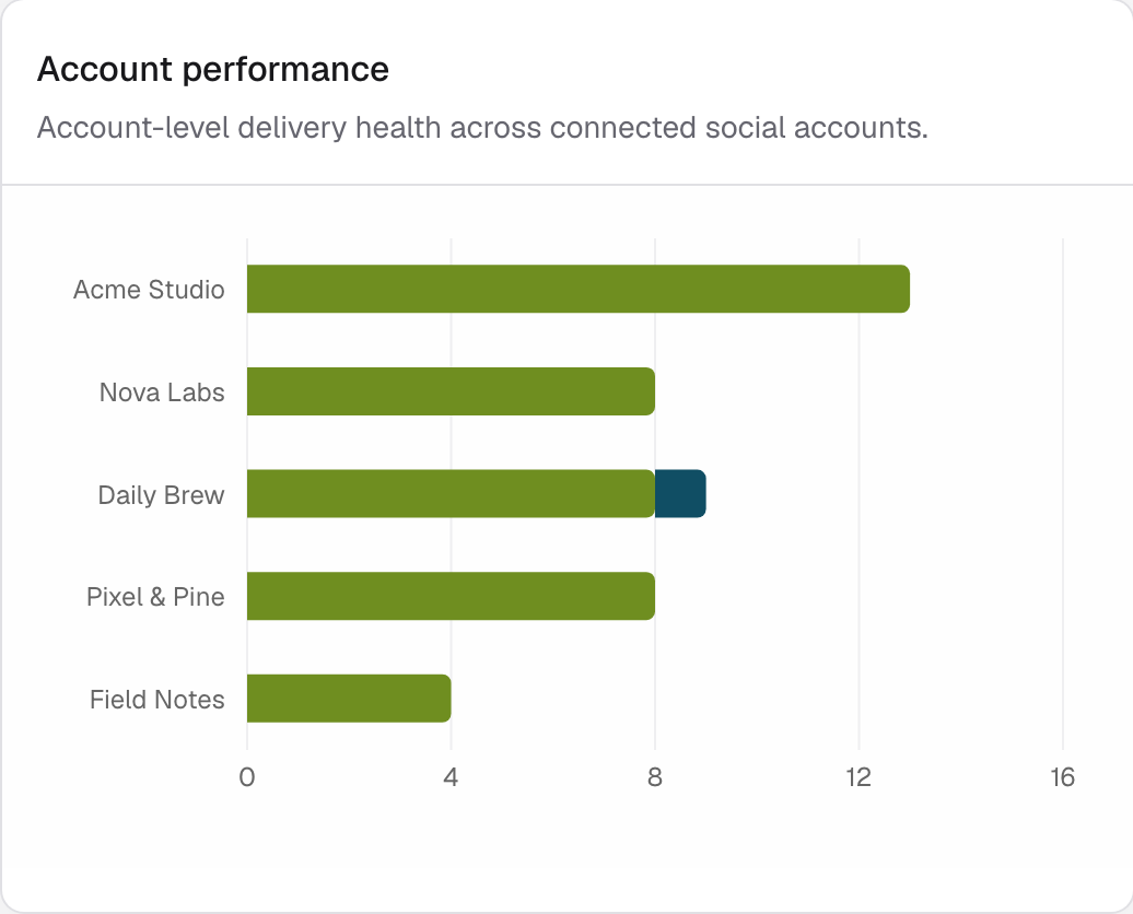
Account performance
Delivery health for each connected account.
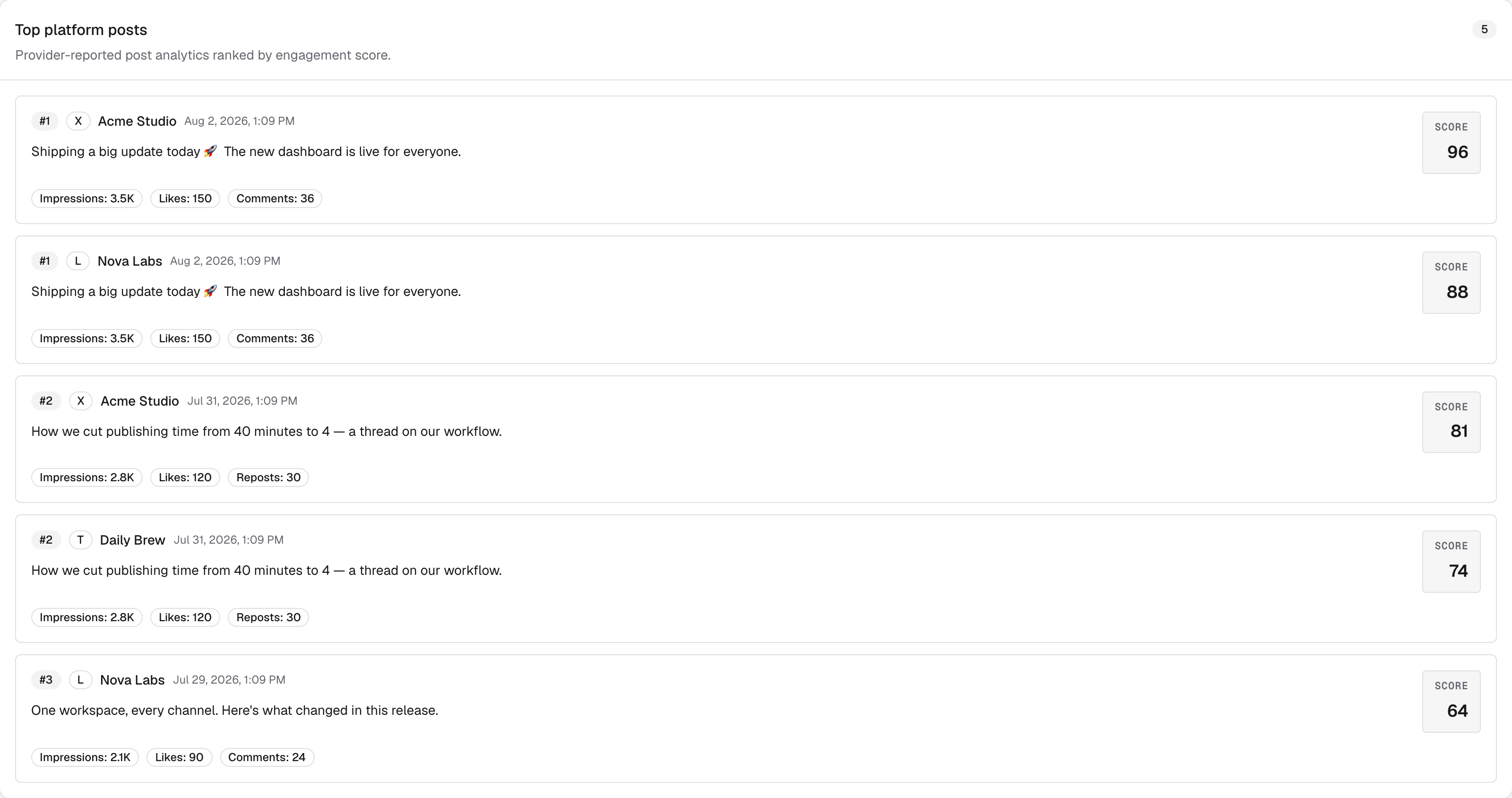
Top platform posts
Your published posts ranked by an engagement score built from the metrics each platform returns — a quick answer to "what actually worked?"